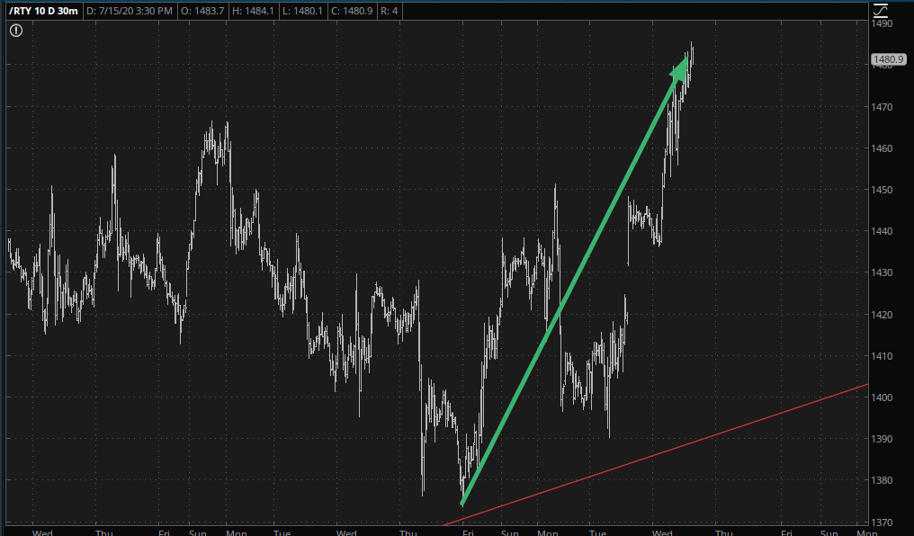
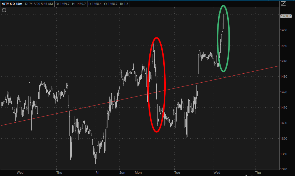
Slope of Hope Blog Posts

Slope initially began as a blog, so this is where most of the website’s content resides. Here we have tens of thousands of posts dating back over a decade. These are listed in reverse chronological order. Click on any category icon below to see posts tagged with that particular subject, or click on a word in the category cloud on the right side of the screen for more specific choices.

A Really Big Earnings Season

By -

The current earnings reports that begin rolling out this week will be among the most important since the financial crisis, if not even before that.  To explain why, let us start with some background data.  Exhibit 1 plots the three major stock market indexes from the start of the year through the close on July 10, 2020.  Although all three indexes have bounced back from the depths of the Covid crash, there is a marked discrepancy between them.  That discrepancy is due to the fact much of the recovery from the low point can be attributed to a relatively few big tech stocks that rose dramatically.  Although the great majority of stocks have fallen year to date, some of the biggest tech companies have risen enough to pull up the indexes.  The Dow lags because it contains fewer tech companies and because it weights them less than their market value.

season earnings
(more…)

Introducing Transformer

By -

OK, folks, another Tim thought of this when he was swimming” feature, and I think you’re going to love it. I’ve never seen anything like it anywhere else, and for now everyone can access it (in a little while, it’ll just be premium members). It’s called the Transformer feature.

The Transformer in SlopeCharts is a unique way to apply a formula to every single symbol you enter. This can be a tremendous time-saver if you want to have a customized perspective into any symbols you enter, particularly those within a watch list, since it is vastly more efficient to have the formula automatically applied as opposed to altering every symbol you want to see.

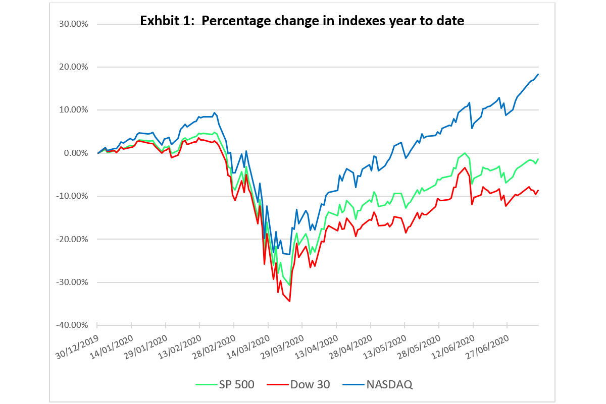
A very simple example would be if you wanted to view a series of assets proportionate to the Federal Reserve’s M2 money supply. In other words, you want to see every symbol divided by the M2 value. This new perspective might lead you to some important new insights.

(more…)

The Big Picture Continuum

By -

The Continuum (monthly 30yr yield with the 100 month EMA ‘limiter’) simply states that the economy was weakening, as were inflation expectations, before 2020. In early 2020 we got a real deflationary jolt from which asset markets are still clawing back, with full frontal inflationary support from a Federal Reserve desperate to keep asset owners whole (and further enriched) and to further punish savers and those without the means to invest in the racket.

They called Ben Bernanke “the Hero” but he was actually the perpetrator of the next debt-backed inflation that would further ruin the country, primarily by greatly increasing the divide between asset owners and everyone else. If we had taken the pain in 2008 and 2009 we’d be on a new system now. Instead, we are riding the Greenspan>Bernanke>Powell continuum. Yellen is omitted because nothing egregious happened under her watch. She slipped in between the cycles and fell through the cracks.

(more…)