
The rising channel on ES caught the low yesterday perfectly, and after the very strong reversal on the jobs figures before yesterday's open, we're now nearly back to the top of the channel, which I have in the 1278.5 area:
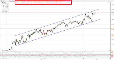
That still doesn't get ES to my main target for this move up. Pug's got a primary target of 1291 SPX for this move up, with a secondary target at 1315 if 1291 isn't held. That fits pretty well with my main target, which is at the upper trendline on the ES rising wedge since July. That is at 1284.5 ES (1288.5 SPX) if we were to hit it today, which I'm not expecting:

This current move up has dragged on longer than I expected. When I first posted the rising wedge above in early December the target was in the 1250 area. Nonetheless what I'm expecting to happen after the target is hit remains the same, with a large correction accompanied by a strong move up in USD. USD has been drifting sideways as SPX has inched upwards, but every time I'm been wondering whether the USD rally is over it has bounced back up again. I'm seeing what appears to be a bull flag forming on USD, and that should get USD to the next key resistance level at 83.6. I've done a longer term USD chart to show the two likely targets for this move. I'm leaning towards the lower (triangle) target but if an IHS forms with the neckline at 83.6 I'll be looking at the higher (channel) target in the 93.5 to 95 area:
I'd like to see silver correct while equities correct, as that will keep the important gold/silver ratio indicator on side, and that's looking very promising on the big picture daily chart, where silver has made a nice reversal at resistance and has (briefly) penetrated the support trendline for the move up from 18. I'm not expecting a move to the main support trendline marked on the chart, but I think a retracement to the 22 area looks very possible:

As an aside I was looking at PCLN yesterday and thought I'd post the longer term chart for PCLN. The chart is weekly and I've done it on log scale, as it handles the huge swings in a more visually friendly format. This is a simply astonishing chart, with PCLN losing over 99% of its value from $990 after the tech bubble imploded, making a double bottom just over $6 in 2001-3, and then recovering to $144.34 in early 2008 before the property bubble imploded. After dropping back to $45.15 in November 2008 it has since risen almost 1000% to close yesterday at $433.60, which is slightly over three times the level of the 2008 high. Simply amazing and I'm wondering whether this could actually make a new high before the current government debt based speculative bubble implodes as well. Only in the long bubble era of Greenspan and Bernanke could anyone see a chart like this one:

