Normally the COT report comes out every Friday for the prior week ending on Tuesday but with the holidays of late the reports have been coming out on Monday, hence the double COT report this week. In the prior post I mentioned how it looked like based on commercial traders positions in oil, copper and the long bond that the SPX could in fact be ready to turn here. The data still supports that as shown in the following charts:
Chart 1 – 30 Year Treasury Price VS 30 Year Commercial Net Position
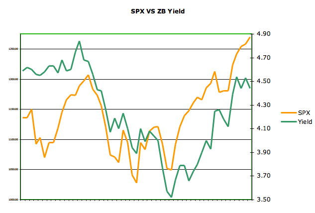
Traders continue to main a more short position implying coming bond strength (higher price lower yield). Check out Chart 2 below for a comparison on S&P 500 VS 30 Year Bond Yield.

Chart 2 – 30 Year Treasury Yield VS S&P 500

Chart 3 – S&P 500 VS Copper Commercial Net Position
Copper correlates very closely as shown in last week's charts with the SPX. Looks like commercial traders are continuing to trade around lower copper prices or at least less strength.
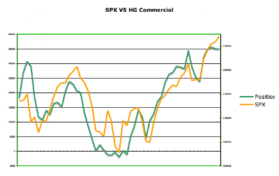
Chart 4 – S&P 500 VS Oil Commercial Net Position
Oil correlates nicely with the SPX although lately not as well as copper. Regardless, similar to the position in copper, commercial traders look to be positioned around coming oil weakness.

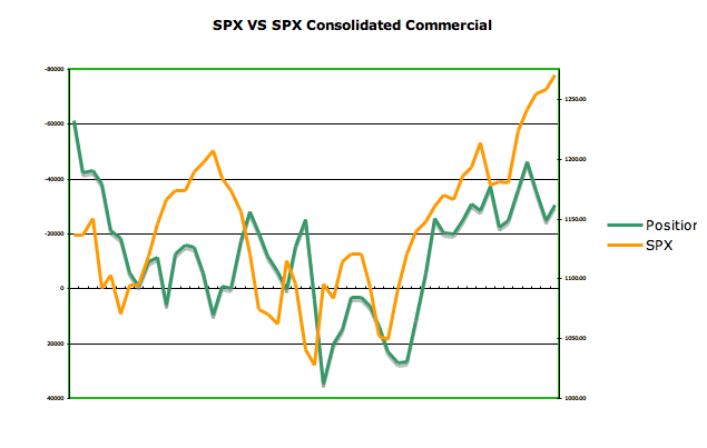
Chart 5 – S&P 500 VS S&P500 Consolidated Commercial Net Positions
Honestly, not sure how much you can read into week to week changes here but the charts do somewhat correlate. What's standing out is the broad divergence right now. Would imply SPX weakness.

Submitted by Runedge. If you would like to follow my blog please visit - Ultra Trading