Slope of Hope Blog Posts

Slope initially began as a blog, so this is where most of the website’s content resides. Here we have tens of thousands of posts dating back over a decade. These are listed in reverse chronological order. Click on any category icon below to see posts tagged with that particular subject, or click on a word in the category cloud on the right side of the screen for more specific choices.

Bitcoin’s Slippery Search for Fair Value

By -

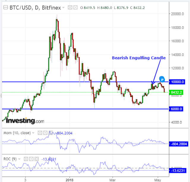
My last post on Bitcoin made reference to a bearish engulfing candle that had formed on the daily timeframe.

Since then, its price drifted slightly upwards, then plunged and closed below the low of that candle on Friday, as shown on the following daily chart.

The momentum and rate-of-change indicators did not confirm the recent higher price high, but are both in an accelerating diverging downtrend, and are below their zero levels.

Bitcoin Daily

(more…)

Forthcoming

By -

Happy Saturday, Slopers. Although the list of fixes, improvements, and new features for Slope is numbering about 70 right now (and increasing all the time, thanks to my poolside scribbles), I wanted to highlight a few specific items that are “top of list” right now.

True Real-Time Comments: The comments section has always been the most popular part of the blog. It is active enough, and auto-updating enough, to seem almost like a live group discussion. However, we have found some pretty nasty inefficiencies in the code, and it’s actually the comments system more than anything else that’s hammering the server CPUs so badly. Very soon after the launch, we dramatically reduced the speed that comments are auto-updated, just to give the servers breathing room. However, we are taking a completely different technical approach to this so that, when we’re done, comments will be virtually instantaneously updating and the CPU load will collapse to nothing. This is, trust me, priority ONE.

+ Mobile-Friendly Comments: As nice as the comments system looks on a desktop, it becomes a wreck on a tiny mobile screen. We are going to introduce a new “mode” for comments so that buttons are much smaller and the entire layout is more mobile-friendly.

+ SlopeCharts to SocialTrade and Comments: We already had the ability to “push” a SlopeChart into SocialTrade, but we broke it during the move. That’ll give fixed. On top of that, we’re going to add a feature to push a chart directly to the comments system as well.

If there is any other show-stopper problem you’ve got, I’d like to hear it, so just click here.
VIX “Normal” Price Range Using TPO Profile Study

By -

TPO stands for Time Price Opportunity. By using a TPO profile chart, you are able to analyze the amount of trading activity, based on time, for each price level that the market traded at for any given time period. The Point of Control (POC) is the price where it spent the most time during that period and in that timeframe.

If you look at the following monthly chart of the VIX with the TPO profile study added to it along the right hand side, you’ll see that its POC (on a monthly basis) since 1986 is 20.53.

Whereas, the TPO POC on a daily timeframe from 1986 is 14.66, as shown on the daily chart below.

This tells me that the average “normal” range of the VIX during the past 33 years is between 14.66 and 20.53, regardless of its trading activity on either a monthly or daily timeframe.

I’d also go a bit further and say that any time it traded outside that range for any length of time, it was “unusual” and, therefore, unsustainable…something to consider when you’re taking longer position trades in equities.

As of Thursday’s close, the VIX was trading in “unusual” territory at 13.23below the “normal” range, where it has spent most of its time since the November 2016 general election.

The last time it spent the majority of its time below the “normal” range was from 2005 to 2007 leading up to the 2008/09 financial crisis. (more…)