Slope of Hope Blog Posts

Slope initially began as a blog, so this is where most of the website’s content resides. Here we have tens of thousands of posts dating back over a decade. These are listed in reverse chronological order. Click on any category icon below to see posts tagged with that particular subject, or click on a word in the category cloud on the right side of the screen for more specific choices.

Seven Paths for SlopeCharts

By -

Now that we’ve got our new technical infrastructure firmly in place, we’re getting development momentum again. There will be times that one important new feature rolls out each and every day. This has been one such week.

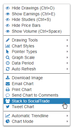
I want you to know there are now seven distincts to make use of a chart from SlopeCharts. The most obvious, is (1) viewing it on your screen. That’s pretty much where everyone else’s charts stop. But when you right-click on the chart and present the menu, you’ll see you can also (2) download the image to your drive (3) email the chart, including an optional message (4) print it (5) push the charts to the comments stream (6) or send it to your Twitter followers. There is a number (7), however, which is:

StacktoSS (more…)

Gas Money

By -

Sheesh, what is with this market? Tuesday was awesome for me. Wednesday was absolutely horrible. And now today, Thursday, is going great. Could the market make up its mind? No, I’ll go one better. Have the market go down 2% daily, every day, until it is 0. That’ll suit me nicely. This up/down/up/down stuff is driving both the good guys (the bears) and the wicked evildoers (the bulls) out of their respective minds. It’s sick.

Anyway. I wanted to share a couple of unrelated short ideas (tied together by my clever post title). The first is the financial sector, XLF, which gapped down nicely where that circle is shown. This sector peaked back on January 29th, and its gap is at 27.72. I have so many bank stocks in my portfolio already, it would be redundant for me to short this one too, but it’s a cool chart.

XLF (more…)

S&P 500 Index: Poised for June Breakout?

By -

In my last post on the S&P 500 Index (SPX), I mentioned 2750 as major resistance and 2680 as near-term support.

Since then, price has bounced around in between those levels, as shown on the daily chart below. At the moment, those two levels are confirmed by a variety of intersecting trendlines…most notably the two red horizontal lines (2748 and 2685), which are the nearest to these two levels.

Until we see a clean break and hold either above or below this red consolidation zone, the SPX will continue its sometimes extreme, volatile whipsaw action in a trendless manner.

It’s unclear whether momentum favours a breakout to the upside, inasmuch as the last swing high on the momentum indicator was lower than its previous swing high, in a divergence with the last two swing highs made by the price. However, this may have been intentional and meant to be used as a possible “bear trap” in preparation for the resumption of the rally that began in early April. (more…)