Slope of Hope Blog Posts

Slope initially began as a blog, so this is where most of the website’s content resides. Here we have tens of thousands of posts dating back over a decade. These are listed in reverse chronological order. Click on any category icon below to see posts tagged with that particular subject, or click on a word in the category cloud on the right side of the screen for more specific choices.

Vastly-Improved Earnings Calendar

By -

Every premium member on Slope -from Bronze all the way up to the glorious Diamond level – – gets access to the Earnings Calendar. Until recently, however, you simply got a list of all the earnings happening on a certain day. Let’s face it, there are days when 400 companies might be reporting, and you only care about 5 of them.

Now what we’re doing is sorting intelligently based on the popularity of the instruments in question. Thus, when you look at the list, it will automatically sort based on this, maximizing the likelihood of you actually seeing a stock that you care about as opposed to some obscure thing that trades 500 shares a day.

calendar

Post-Plunge Percentages (by Pianoman)

By -

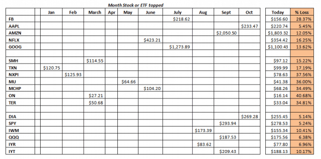
You can do this easily over the weekend. Target an industry, open a spreadsheet and see what month that industry, ETF or stock topped and compare to today’s price. I was a bit surprised by the data below. From my perspective, and the data, we have been in distribution since January. However, the news has kept our eye on FAANG and the indices which topped later in the year. The prices in ‘Today’ are prices since the market opened and not EOD for either Thursday or Friday.

changes (more…)

DATS a New Interface!

By -

As any unfortunate soul who has ever lived with me can attest, I am a neat freak. I like things orderly. If you have some books out and head to the bathroom, the books will probably be gone when you return. It’s just how I am. Terribly sorry. Those books weren’t being used.

This works out better for product development, however, because I am ceaselessly trying to bring order to places where chaos abides. With SlopeCharts, I was increasingly bothered that as we kept adding features, the menus got more and more cluttered. I feared that our marvelous feature set would get buried under all the clutter.

Thus, this weekend, we totally reworked how the menus were organized. I am much happier now with what I call our DATS setup: that is, Display, Analysis, Tools, and Social. (more…)

SPX/Gold, 30yr Yields & Yield Curve – Amigos 1, 2 & 3 Updated

By -

We began the Amigos theme last year in order to be guided by the goofy riders during the ending stages of a cyclical, risk-on phase that was not going to end until the proper macro signals come about, no matter how many times the bears declared victory along the way. The fact that grown adults see conspiracies around every corner (okay, I see them around every third corner myself, but work with me here) makes such macro signaling very necessary in order to keep bias at bay.

(more…)